
Table of Contents
The Power of Visual Communication in Packaging: A Comprehensive Guide
Companies are always looking for new ways to increase sales and build brand loyalty. Product packaging is a strong tool for doing just that. People are influenced by what they see, hear, touch, taste, and smell, and many brands use this to their benefit. This is where visual communication in packaging becomes super important. This Visual Communication guide will explore the details of how visuals in packaging work and show you how they can seriously boost your product’s sales.
How Visuals Impact Customer Behavior
Visual Communication is essential for driving sales. Studies consistently demonstrate that a large part of what makes people satisfied comes from engaging their senses. That’s why brands carefully design their packaging visuals to stand out in the market. Often, a product’s packaging is the very first thing a potential customer sees. Because of this, Visual Communication is incredibly important for increasing sales.
When businesses focus on creating visuals that appeal to our senses, it builds brand recognition and positively impacts their bottom line. Updating your packaging visuals can directly lead to higher product sales.
Directing the Customer’s Eye by Establishing Visual Communication Hierarchy
Visual hierarchy is all about intentionally arranging design elements to lead a person’s eye through a layout smoothly and logically. It’s the skill of organizing visuals to show what’s most important. Even the Nielsen Norman Group, a well-known UX consulting firm, points out that visual hierarchy controls how someone experiences something.
In packaging design, certain elements are intentionally emphasized to create a clear order of importance for the information. This strategic placement ensures that crucial details are easily noticed by potential customers, prompting them to take action.
Visual Communication Hierarchy Components
Many elements within visual hierarchy can significantly strengthen a product’s market position. The smart placement of these elements is the foundation of good design. When you use them effectively, your packaging can really help increase sales. Let’s look at the important elements of visual hierarchy:
- Text: Almost all designs, even the simplest, include text. Whether it’s your product’s name or vital user information, the strategic placement of textual information is crucial. Health, beauty, and food packaging especially rely on text to encourage potential customers to make a purchase. The most important thing is to position this text on your packaging thoughtfully.
- Font: The right font style on your packaging is key, and it really comes down to your business niche and who you’re trying to reach. For example, if your brand targets a younger crowd, Sans Serif fonts often work well because of their clean, modern look. For a personal touch, like a special message, you might want a font that looks like handwriting. But if your audience is older, it’s usually best to avoid cursive fonts to keep the design easy to read and simple.
- Text Color: Clashing colors can be a real turn-off, so it’s vital to know how to use color effectively on your packaging to grab customer attention. As you choose your palette, focus on three key elements: saturation, value, and temperature. Saturated colors are vibrant because they contain less gray. However, using only highly saturated colors can make your packaging look chaotic. Meanwhile, temperature refers to a color’s warmth or coolness. Juxtaposing warm and cool tones can really make your design pop and draw the eye.
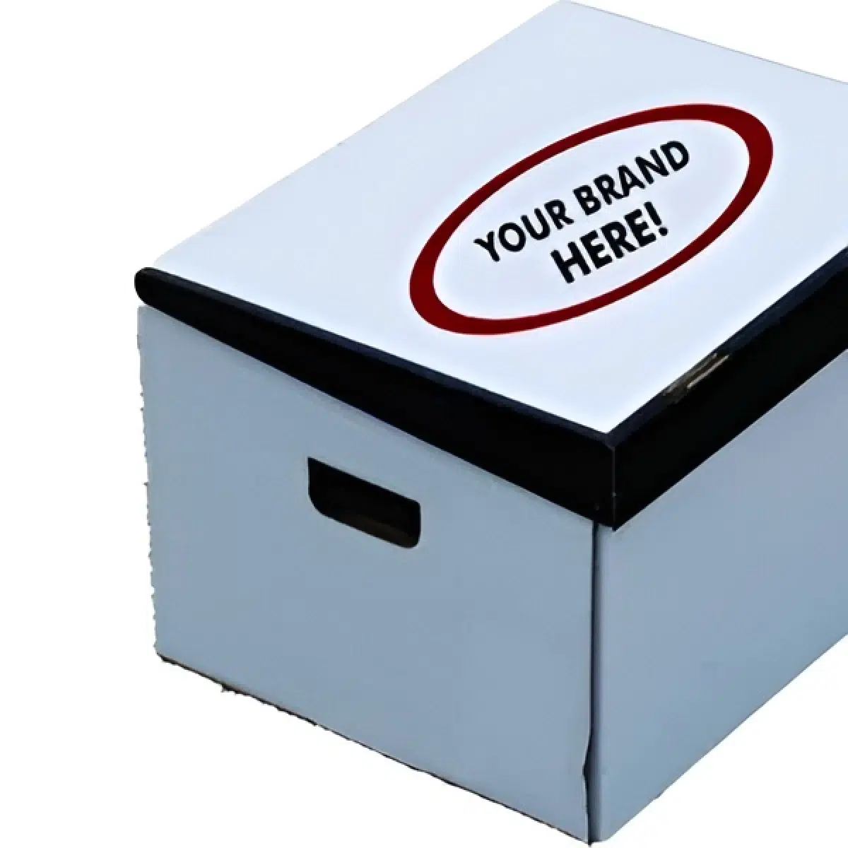
Packaging that Sells: Differentiate Your Brand with Striking Visuals
Visual communication in packaging is crucial for boosting sales and building brand loyalty. Compelling packaging visuals are often a customer’s first interaction with a product, directly influencing purchasing decisions and brand recognition.
Visual hierarchy in packaging design can strategically guide a customer’s eye to key information. The strategic placement of text, selecting the appropriate font style based on niche and audience, and effectively using text color considering saturation, value, and temperature will attract the attention of potential customers.
GET A FREE LOGISTICS ESTIMATE
We will not respond to solicitation or employment inquiries through this form.